Monday, February 8, 2016

Natural Language Processing with Python


Introduction

Natural language processing, or NLP, is a process of analyzing the text and extracting insights from it. It is used everywhere, from search engines such as Google or Bing, to voice interfaces such as Siri or Cortana. The pipeline usually involves tokenization, replacing and correcting words, part-of-speech tagging, named-entity recognition and classification. In this article we'll be describing tokenization, by using a full example from Kaggle notebook. The full code can be found on GitHub repository.


Installation

For the purposes of NLP, we'll be using NLTK Python library, a leading platform to work with human language data. It provides easy-to-use interfaces to over 50 corpora and lexical resources such as WordNet, along with a suite of text processing libraries for classification, tokenization, stemming, tagging, parsing, and semantic reasoning, wrappers for industrial-strength NLP libraries. Installing the package is easy using the Python package manager:

pip install nltk

Implementation

Let's walk through the Kaggle notebook and see that we understand what is done there. We'll be using already covered packages like Pandas, Scikit-Learn and Matplotlib. In addition we'll be using Seaborn, Python visualization library based on Matplotlib, which of course can be installed using the Python package manager:

pip install seaborn

The notebook analyzes the US baby names data between 1880 and 2014 and will be looking into questions how frequency occurrence of names in Bible correlate with US baby names. Firstly we'll load the data located in CSVs files, using Pandas read_csv method. To extract the names from the bible, the use of NLTK is done by taking advantage of nltk.tokenize package. Since we need all words staring with capital letter, we'll construct an appropriate regular expression rule. More about regular expression syntax can be found here.

nationalNamesDS = pd.read_csv(nationalNamesURL)
stateNamesDS = pd.read_csv(stateNamesURL)

bibleNamesDS = pd.read_csv(bibleNamesURL)
# retrieve all words starting with capital letter and having atleast length of 3
tokenizer = RegexpTokenizer("[A-Z][a-z]{2,}")
# load new testament
file = open(newTestamentURL)
bibleData = file.read()
file.close()
newTestamentWordsCount = pd.DataFrame(tokenizer.tokenize(bibleData))
.apply(pd.value_counts)

# load old testament
file = open(oldTestamentURL)
bibleData = file.read()
file.close()
oldTestamentWordsCount = pd.DataFrame(tokenizer.tokenize(bibleData))
.apply(pd.value_counts)

NLP is never used by itself and usually you'll want to some pre-processing prior to analyzing with text. Using Pandas drop and merge methods, we'll remove irrelevant columns and join the Bible capital words with known names from the Bible:

# remove irrelevant columns
stateNamesDS.drop(['Id', 'Gender'], axis=1, inplace=True)
nationalNamesDS.drop(['Id', 'Gender'], axis=1, inplace=True)

# retrieve unique names count of each testament
bibleNames = pd.Series(bibleNamesDS['Name'].unique())
# filtering out Bible names
newTestamentNamesCount = pd.merge(newTestamentWordsCount,
pd.DataFrame(bibleNames), right_on=0, left_index=True)
newTestamentNamesCount = newTestamentNamesCount.ix[:, 0:2]
newTestamentNamesCount.columns = ['Name', 'BibleCount']

oldTestamentNamesCount = pd.merge(oldTestamentWordsCount,
pd.DataFrame(bibleNames), right_on=0, left_index=True)
oldTestamentNamesCount = oldTestamentNamesCount.ix[:, 0:2]
oldTestamentNamesCount.columns = ['Name', 'BibleCount']

Great, now that we have our data, let's plot it with Matplotlib:

# plot top TOP_BIBLE_NAMES old testament names
topOldTestamentNamesCount = oldTestamentNamesCount.sort_values('BibleCount', ascending=False).head(TOP_BIBLE_NAMES)
topOldTestamentNamesCount.plot(kind='bar', x='Name', legend=False, title='Old Testament names count')
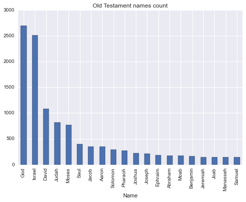
DataScience is not just applying some already written algorithms and plotting the results. The insight to the domain is required to make a valuable and meaningful decisions. Otherwise we could just use Amazon Machine Learning. Using this knowledge, we understand that two the most frequent names are 'God' and 'Israel' should be removed. 'God' is not really a name, even though there is a statistically insignificant number of babies with this name in US. Despite 'Israel' being a name, it's also a country, of which Old Testament is all about.

oldTestamentNamesCount = oldTestamentNamesCount.drop(oldTestamentNamesCount[(oldTestamentNamesCount.Name == 'God') | (oldTestamentNamesCount.Name == 'Israel')].index)

After the pre-processing stage, the analysis starts. We wanted to see the correlate of frequency occurrence, so for this we'll be using Pearson correlation by Pandas corr method and plotting the data using Seaborn package. Why? The Matplotlib package, despite being a great one, doesn't provide very easy to use interface to plotting a scatter plot with colored categories. So, to ease our life, we'll use another package which supports exactly that. Have a close look at the code in lines 7-9. Since scatter plot method requires 2 dimensional data, we have to make our data such, by removing and flattening the data using Pandas unstack and reset_index methods.

# scale and calculate plot states with high corr
def plotStateCorr(stateNamesCount, title):
    stateNamesCount[['Count','BibleCount']] = stateNamesCount[['Count','BibleCount']].apply(lambda x: MinMaxScaler().fit_transform(x))
    stateNamesCount = stateNamesCount.groupby(['Year', 'State']).corr()
    stateNamesCount = stateNamesCount[::2]
    highCorrStateNamesCount = stateNamesCount[stateNamesCount.Count > HIGH_CORR_THRESHOLD]
    highCorrStateNamesCount.drop(['BibleCount'], axis=1, inplace=True)
    highCorrStateNamesCount = highCorrStateNamesCount.unstack()
    highCorrStateNamesCount = highCorrStateNamesCount.reset_index()
    fg = sns.FacetGrid(data=highCorrStateNamesCount, hue='State', size=5)
    fg.map(pyplot.scatter, 'Year', 'Count').add_legend().set_axis_labels('Year', 'Correlation coefficient')
    sns.plt.title(title)

plotStateCorr(newTestamentStateNamesCount, 'Correlation of New Testament and US state names')
plotStateCorr(oldTestamentStateNamesCount, 'Correlation of Old Testament and US state names')
oldTestamentStateNamesCount = None
newTestamentStateNamesCount = None
stateNamesDS = None

Similar stages of pre-processing is done on national scale, without any particular interesting difference, so we'll be ending our discussing at this point. You can of course follow the Kaggle notebook code and explanation till the end.

Conclusion

NLP with the assistance of NLTK library, provides us with tools, which open a huge spectrum of possibilities to us, previously only available to linguists professionals. In this article we've taken a glimpse at what NLTK does, by using tokenization tools. In the next articles we'll cover other aspects of NLP.

Wednesday, January 27, 2016

SVM kernel approximation with Python


Introduction

A high-performance SVM classifier will likely need thousands of support vectors, and the resulting high complexity of classification prevents their use in many practical applications, with large numbers of training samples or large numbers of features in the input space. To handle this, several approximations to the RBF kernel (and similar kernels) have been devised. Typically, these take the form of a function z that maps a single vector to a vector of higher dimensionality, approximating the kernel.

where Phi is the implicit mapping embedded in the RBF kernel.

Implementation

Scikit-learn has already implemented Fourier transform and Nystroem approximation techniques using RBFSampler and Nystroem classes accordingly.

import matplotlib.pyplot as plt
import numpy as np
from sklearn import datasets, svm, pipeline
from sklearn.kernel_approximation import (RBFSampler, Nystroem)
# The digits dataset
digits = datasets.load_digits(n_class=9)

# To apply an classifier on this data, we need to flatten the image, to
# turn the data in a (samples, feature) matrix:
n_samples = len(digits.data)
data = digits.data / 16.
data -= data.mean(axis=0)

# We learn the digits on the first half of the digits
data_train, targets_train = data[:n_samples / 2], digits.target[:n_samples / 2]

# Now predict the value of the digit on the second half:
data_test, targets_test = data[n_samples / 2:], digits.target[n_samples / 2:]

# Create a classifier: a support vector classifier
kernel_svm = svm.SVC(gamma=.2)
linear_svm = svm.LinearSVC()

# create pipeline from kernel approximation
# and linear svm
feature_map_fourier = RBFSampler(gamma=.2, random_state=1)
feature_map_nystroem = Nystroem(gamma=.2, random_state=1)
fourier_approx_svm = pipeline.Pipeline([("feature_map", feature_map_fourier),
                                        ("svm", svm.LinearSVC())])

nystroem_approx_svm = pipeline.Pipeline([("feature_map", feature_map_nystroem),
                                        ("svm", svm.LinearSVC())])

# fit and predict using linear and kernel svm:
kernel_svm.fit(data_train, targets_train)
kernel_svm_score = kernel_svm.score(data_test, targets_test)

linear_svm.fit(data_train, targets_train)
linear_svm_score = linear_svm.score(data_test, targets_test)

sample_sizes = 30 * np.arange(1, 10)
fourier_scores = []
nystroem_scores = []
fourier_times = []
nystroem_times = []

for D in sample_sizes:
    fourier_approx_svm.set_params(feature_map__n_components=D)
    nystroem_approx_svm.set_params(feature_map__n_components=D)
    
    nystroem_approx_svm.fit(data_train, targets_train)
    fourier_approx_svm.fit(data_train, targets_train)

    fourier_score = fourier_approx_svm.score(data_test, targets_test)
    nystroem_score = nystroem_approx_svm.score(data_test, targets_test)
    nystroem_scores.append(nystroem_score)
    fourier_scores.append(fourier_score)

# plot the results:
accuracy = plt.figure(figsize=(8, 8))
accuracy = plt.subplot()
accuracy.plot(sample_sizes, nystroem_scores, label="Nystroem approx. kernel")
accuracy.plot(sample_sizes, fourier_scores, label="Fourier approx. kernel")
accuracy.plot([sample_sizes[0], sample_sizes[-1]],
              [linear_svm_score, linear_svm_score], label="linear svm")
accuracy.plot([sample_sizes[0], sample_sizes[-1]],
              [kernel_svm_score, kernel_svm_score], label="rbf svm")

# legends and labels
accuracy.set_title("Classification accuracy")
accuracy.set_xlim(sample_sizes[0], sample_sizes[-1])
accuracy.set_ylim(np.min(fourier_scores), 1)
accuracy.set_ylabel("Classification accuracy")
accuracy.legend(loc='best')

Take a look at score plot of different techniques, the more features we use the closer the approximation to original kernel. And since the whole point of approximation was to use it on large number of features, this is exactly what we want to achieve.

Conclusion

SVM kernel approximation can dramatically speed up the prediction process with minimal accuracy loss, enabling the usage of SVM in production resource limited systems.

Friday, January 8, 2016

Anomaly detection with Python


Introduction

The goal of anomaly detection is to identify cases that are unusual within data that is seemingly homogeneous. Anomaly detection is an important tool for detecting fraud, network intrusion, and other rare events that may have great significance but are hard to find.

Outliers are cases that are unusual because they fall outside the distribution that is considered normal for the data. The distance from the center of a normal distribution indicates how typical a given point is with respect to the distribution of the data. Each case can be ranked according to the probability that it is either typical or atypical.

Anomaly detection is a form of classification and is implemented as one-class classification, because only one class is represented in the training data. An anomaly detection model predicts whether a data point is typical for a given distribution or not. An atypical data point can be either an outlier or an example of a previously unseen class. Normally, a classification model must be trained on data that includes both examples and counter-examples for each class so that the model can learn to distinguish between them.

Implementation

Scikit-learn implements One-class SVM algorithm, which detects the soft boundary of that set so as to classify new points as belonging to that set or not. The class that implements this is called OneClassSVM.

import numpy as np
import matplotlib.pyplot as plt
import matplotlib.font_manager
from sklearn import svm

# Generate train data
X = 0.3 * np.random.randn(100, 2)
X_train = np.r_[X + 2, X - 2]
# Generate some regular novel observations
X = 0.3 * np.random.randn(20, 2)
X_test = np.r_[X + 2, X - 2]
# Generate some abnormal novel observations
X_outliers = np.random.uniform(low=-4, high=4, size=(20, 2))

# fit the model
clf = svm.OneClassSVM(nu=0.1, kernel="rbf", gamma=0.1)
clf.fit(X_train)
y_pred_train = clf.predict(X_train)
y_pred_test = clf.predict(X_test)
y_pred_outliers = clf.predict(X_outliers)
n_error_train = y_pred_train[y_pred_train == -1].size
n_error_test = y_pred_test[y_pred_test == -1].size
n_error_outliers = y_pred_outliers[y_pred_outliers == 1].size

# plot the line, the points, and the nearest vectors to the plane
xx, yy = np.meshgrid(np.linspace(-5, 5, 500), np.linspace(-5, 5, 500))
Z = clf.decision_function(np.c_[xx.ravel(), yy.ravel()])
Z = Z.reshape(xx.shape)

plt.title("Novelty Detection")
plt.contourf(xx, yy, Z, levels=np.linspace(Z.min(), 0, 7), cmap=plt.cm.Blues_r)
a = plt.contour(xx, yy, Z, levels=[0], linewidths=2, colors='red')
plt.contourf(xx, yy, Z, levels=[0, Z.max()], colors='orange')

b1 = plt.scatter(X_train[:, 0], X_train[:, 1], c='white')
b2 = plt.scatter(X_test[:, 0], X_test[:, 1], c='green')
c = plt.scatter(X_outliers[:, 0], X_outliers[:, 1], c='red')
plt.axis('tight')
plt.xlim((-5, 5))
plt.ylim((-5, 5))
plt.legend([a.collections[0], b1, b2, c],
           ["learned frontier", "training observations",
            "new regular observations", "new abnormal observations"],
           loc="upper left",
           prop=matplotlib.font_manager.FontProperties(size=11))
plt.xlabel(
    "error train: %d/200 ; errors novel regular: %d/40 ; "
    "errors novel abnormal: %d/40"
    % (n_error_train, n_error_test, n_error_outliers))
plt.show()

Since we only have one category, normal points are marked by 1 and outliners are marked by -1.

Conclusion

Anomaly detection is applicable in a variety of domains, such as intrusion detection, fraud detection, fault detection, system health monitoring, event detection in sensor networks, and detecting Eco-system disturbances. It is often used in preprocessing to remove anomalous data from the dataset. In supervised learning, removing the anomalous data from the dataset often results in a statistically significant increase in accuracy.

Monday, December 28, 2015

K-nearest Neighbors (KNN) in Python


Introduction

Neighbors-based classification is a type of instance-based learning or non-generalizing learning: it does not attempt to construct a general internal model, but simply stores instances of the training data. Classification is computed from a simple majority vote of the nearest neighbors of each point: a query point is assigned the data class which has the most representatives within the nearest neighbors of the point.


Implementation

scikit-learn implements two different nearest neighbors classifiers: KNeighborsClassifier implements learning based on the k nearest neighbors of each query point, where k is an integer value specified by the user. RadiusNeighborsClassifier implements learning based on the number of neighbors within a fixed radius r of each training point, where r is a floating-point value specified by the user.

import numpy as np
import matplotlib.pyplot as plt
from matplotlib.colors import ListedColormap
from sklearn import neighbors, datasets

n_neighbors = 15

# import some data to play with
iris = datasets.load_iris()
X = iris.data[:, :2]  # we only take the first two features.
y = iris.target

h = .02  # step size in the mesh

# Create color maps
cmap_light = ListedColormap(['#FFAAAA', '#AAFFAA', '#AAAAFF'])
cmap_bold = ListedColormap(['#FF0000', '#00FF00', '#0000FF'])

# we create an instance of Neighbours Classifier and fit the data.
clf = neighbors.KNeighborsClassifier(n_neighbors)
clf.fit(X, y)

# Plot the decision boundary. For that, we will assign a color to each
# point in the mesh [x_min, m_max]x[y_min, y_max].
x_min, x_max = X[:, 0].min() - 1, X[:, 0].max() + 1
y_min, y_max = X[:, 1].min() - 1, X[:, 1].max() + 1
xx, yy = np.meshgrid(np.arange(x_min, x_max, h),
                     np.arange(y_min, y_max, h))
Z = clf.predict(np.c_[xx.ravel(), yy.ravel()])

# Put the result into a color plot
Z = Z.reshape(xx.shape)
plt.figure()
plt.pcolormesh(xx, yy, Z, cmap=cmap_light)

# Plot also the training points
plt.scatter(X[:, 0], X[:, 1], c=y, cmap=cmap_bold)
plt.xlim(xx.min(), xx.max())
plt.ylim(yy.min(), yy.max())

plt.show()

Now let's see how RadiusNeighborsClassifier works. After playing a bit with hyperparameters, we'll achieve the following plot:

...
clf = neighbors.RadiusNeighborsClassifier(3.0, weights='distance')
...

Conclusion

Despite its simplicity, nearest neighbors has been successful in a large number of classification and regression problems, including handwritten digits or satellite image scenes. Being a non-parametric method, it is often successful in classification situations where the decision boundary is very irregular.

Thursday, December 3, 2015

Classifier Boosting with Python


Introduction

Remember we've talked about random forest and how it was used to improve the performance of a single Decision Tree classifier. The idea of fitting a number of decision tree classifiers on various sub-samples of the dataset and using averaging to improve the predictive accuracy can be used to other algorithms as well and it's called boosting. There are several boosting techniques, which can be used to improve our algorithm, we'll cover the most used ones: AdaBoost and Bagging boost.

AdaBoost

An AdaBoost classifier begins by fitting a classifier on the original dataset and then fits additional copies of the classifier on the same dataset, but where the weights of incorrectly classified instances are adjusted such that subsequent classifiers focus more on difficult cases.

Bagging boost

A Bagging classifier fits base classifiers each on random subsets of the original dataset and then aggregate their individual predictions to form a final prediction.

Implementation

All boosting methods are located under sklearn.ensemble module. Let's see first how to boost SVM using bagging classifier.

import numpy as np
import matplotlib.pyplot as plt
from sklearn.ensemble import BaggingClassifier
from sklearn.datasets import make_gaussian_quantiles
from sklearn.svm import SVC

# Construct dataset
X1, y1 = make_gaussian_quantiles(cov=2.,
                                 n_samples=200, n_features=2,
                                 n_classes=2, random_state=1)
X2, y2 = make_gaussian_quantiles(mean=(3, 3), cov=1.5,
                                 n_samples=300, n_features=2,
                                 n_classes=2, random_state=1)
X = np.concatenate((X1, X2))
y = np.concatenate((y1, - y2 + 1))

# Create and fit an boosted svm
bdt = BaggingClassifier(SVC())

bdt.fit(X, y)

plot_colors = "br"
plot_step = 0.02
class_names = "AB"

plt.figure(figsize=(10, 5))

# Plot the decision boundaries
x_min, x_max = X[:, 0].min() - 1, X[:, 0].max() + 1
y_min, y_max = X[:, 1].min() - 1, X[:, 1].max() + 1
xx, yy = np.meshgrid(np.arange(x_min, x_max, plot_step),
                     np.arange(y_min, y_max, plot_step))

Z = bdt.predict(np.c_[xx.ravel(), yy.ravel()])
Z = Z.reshape(xx.shape)
cs = plt.contourf(xx, yy, Z, cmap=plt.cm.Paired)
plt.axis("tight")

# Plot the training points
for i, n, c in zip(range(2), class_names, plot_colors):
    idx = np.where(y == i)
    plt.scatter(X[idx, 0], X[idx, 1],
                c=c, cmap=plt.cm.Paired,
                label="Class %s" % n)
plt.xlim(x_min, x_max)
plt.ylim(y_min, y_max)
plt.legend(loc='upper right')
plt.xlabel('x')
plt.ylabel('y')
plt.title('Decision Boundary')

Now, let's change the line 18th to AdaBoost and Decision Tree

from sklearn.ensemble import AdaBoostClassifier
from sklearn.tree import DecisionTreeClassifier
...
bdt = AdaBoostClassifier(DecisionTreeClassifier(max_depth=1), algorithm="SAMME", n_estimators=200)
...

Conclusion

Boosting techniques may dramatically improve the base algorithm and serve an irreplaceable tool in any data scientists toolkit.

Thursday, November 19, 2015

K-means clustering with Python


Introduction

K-means is one of the simplest unsupervised learning algorithms that solve the well known clustering problem. The procedure follows a simple and easy way to classify a given data set through a certain K number of clusters. The main idea is to define K centroids, one for each cluster. The next step is to take each point belonging to a given data set and associate it to the nearest centroid. At this point we need to re-calculate K new centroids of the clusters resulting from the previous step. After we have these K new centroids, a new binding has to be done between the same data set points and the nearest new centroid. As a result of this loop we may notice that the K centroids change their location step by step until no more changes are done.

Implementation

Scikit-learn provides with full implementation of K-means algorithm though KMeans class. Let's have a look at several interesting situations, which might occur during data clustering:

import numpy as np
import matplotlib.pyplot as plt
from sklearn.cluster import KMeans
from sklearn.datasets import make_blobs

plt.figure(figsize=(12, 12))

n_samples = 1500
random_state = 170
X, y = make_blobs(n_samples=n_samples, random_state=random_state)

# Incorrect number of clusters
y_pred = KMeans(n_clusters=2, random_state=random_state).fit_predict(X)

plt.subplot(221)
plt.scatter(X[:, 0], X[:, 1], c=y_pred)
plt.title("Incorrect Number of Blobs")

# Anisotropicly distributed data
transformation = [[ 0.60834549, -0.63667341], [-0.40887718, 0.85253229]]
X_aniso = np.dot(X, transformation)
y_pred = KMeans(n_clusters=3, random_state=random_state).fit_predict(X_aniso)

plt.subplot(222)
plt.scatter(X_aniso[:, 0], X_aniso[:, 1], c=y_pred)
plt.title("Anisotropicly Distributed Blobs")

# Different variance
X_varied, y_varied = make_blobs(n_samples=n_samples,
                                cluster_std=[1.0, 2.5, 0.5],
                                random_state=random_state)
y_pred = KMeans(n_clusters=3, random_state=random_state).fit_predict(X_varied)

plt.subplot(223)
plt.scatter(X_varied[:, 0], X_varied[:, 1], c=y_pred)
plt.title("Unequal Variance")

# Unevenly sized blobs
X_filtered = np.vstack((X[y == 0][:500], X[y == 1][:100], X[y == 2][:10]))
y_pred = KMeans(n_clusters=3, random_state=random_state).fit_predict(X_filtered)

plt.subplot(224)
plt.scatter(X_filtered[:, 0], X_filtered[:, 1], c=y_pred)
plt.title("Unevenly Sized Blobs")

plt.show()

At first we wrongly assume that there are 3 clusters in the data and make K-means find them. Later we transform the data anisotropicly. Since K-means uses Euclidian distance to to associate points to clusters, it does not work well with non-globular clusters. The last two datasets introduce blobs of different variance and size, but this makes no difference and the classification succeeds.

Conclusion

K-means provides us with easy to use clustering algorithms. It's fast, easy to follow and is used vastly in various fields including Vector Quantization.

Sunday, November 8, 2015

Naïve Bayes with Python


Introduction

The Naive Bayes algorithm is based on conditional probabilities. It uses Bayes' Theorem, a formula that calculates a probability by counting the frequency of values and combinations of values in the historical data. Bayes' Theorem finds the probability of an event occurring given the probability of another event that has already occurred. If B represents the dependent event and A represents the prior event, Bayes' theorem can be stated as follows. To calculate the probability of B given A, the algorithm counts the number of cases where A and B occur together and divides it by the number of cases where A occurs alone.

Implementation

Scikit-learn provides implementation of Naïve Bayes algorithm of 3 flavors: MultinomialNB implementing the naive Bayes algorithm for multinomially distributed data; GaussianNB implementing the Gaussian Naive Bayes algorithm for classification; and BernoulliNB implements the naive Bayes training and classification algorithms for data that is distributed according to multivariate Bernoulli distributions.

Let's take a look at Naïve Bayes algorithm at work classifying Iris data and since anything the nature produces is distributed according to a Gaussian distribution, we'll be using this appropriate class

import numpy as np
import matplotlib.pyplot as plt
from sklearn.datasets import load_iris
from sklearn.naive_bayes import GaussianNB
 
# Parameters
n_classes = 3
plot_colors = "bry"
plot_step = 0.02
plt.rcParams["figure.figsize"] = [12, 8]
 
# Load data
iris = load_iris()
 
for pairidx, pair in enumerate([[0, 1], [0, 2], [0, 3],
                                [1, 2], [1, 3], [2, 3]]):
    # We only take the two corresponding features
    X = iris.data[:, pair]
    y = iris.target
 
    # Shuffle
    idx = np.arange(X.shape[0])
    np.random.seed(13)
    np.random.shuffle(idx)
    X = X[idx]
    y = y[idx]
 
    # Train
    clf = GaussianNB().fit(X, y)
 
    # Plot the decision boundary
    plt.subplot(2, 3, pairidx + 1)
 
    x_min, x_max = X[:, 0].min() - 1, X[:, 0].max() + 1
    y_min, y_max = X[:, 1].min() - 1, X[:, 1].max() + 1
    xx, yy = np.meshgrid(np.arange(x_min, x_max, plot_step),
                         np.arange(y_min, y_max, plot_step))
 
    Z = clf.predict(np.c_[xx.ravel(), yy.ravel()])
    Z = Z.reshape(xx.shape)
    cs = plt.pcolormesh(xx, yy, Z, cmap=plt.cm.Paired)
 
    plt.xlabel(iris.feature_names[pair[0]])
    plt.ylabel(iris.feature_names[pair[1]])
    plt.axis()
 
    # Plot the training points
    for i, color in zip(range(n_classes), plot_colors):
        idx = np.where(y == i)
        plt.scatter(X[idx, 0], X[idx, 1], c=color,
                    label=iris.target_names[i],
                    cmap=plt.cm.Paired)
    plt.axis()
 
plt.legend(loc="upper left")
plt.show()

Pretty cool, isn't it!

Conclusion

The Naive Bayes algorithm affords fast, highly scalable model building and scoring. It scales linearly with the number of predictors and rows. You'll need, however, a big data set in order to make reliable estimations of the probability of each class. You can use Naïve Bayes classification algorithm with a small data set, but precision and recall will keep very low. For small reminder about what those are, have a look at performance metrics section here.