


Introduction
Natural language processing, or NLP, is a process of analyzing the text and extracting insights from it. It is used everywhere, from search engines such as Google or Bing, to voice interfaces such as Siri or Cortana. The pipeline usually involves tokenization, replacing and correcting words, part-of-speech tagging, named-entity recognition and classification. In this article we'll be describing tokenization, by using a full example from Kaggle notebook. The full code can be found on GitHub repository.
Installation
For the purposes of NLP, we'll be using NLTK Python library, a leading platform to work with human language data. It provides easy-to-use interfaces to over 50 corpora and lexical resources such as WordNet, along with a suite of text processing libraries for classification, tokenization, stemming, tagging, parsing, and semantic reasoning, wrappers for industrial-strength NLP libraries. Installing the package is easy using the Python package manager:
pip install nltk
Implementation
Let's walk through the Kaggle notebook and see that we understand what is done there. We'll be using already covered packages like Pandas, Scikit-Learn and Matplotlib. In addition we'll be using Seaborn, Python visualization library based on Matplotlib, which of course can be installed using the Python package manager:
pip install seaborn
The notebook analyzes the US baby names data between 1880 and 2014 and will be looking into questions how frequency occurrence of names in Bible correlate with US baby names. Firstly we'll load the data located in CSVs files, using Pandas read_csv method. To extract the names from the bible, the use of NLTK is done by taking advantage of nltk.tokenize package. Since we need all words staring with capital letter, we'll construct an appropriate regular expression rule. More about regular expression syntax can be found here.
nationalNamesDS = pd.read_csv(nationalNamesURL)
stateNamesDS = pd.read_csv(stateNamesURL)

bibleNamesDS = pd.read_csv(bibleNamesURL)
# retrieve all words starting with capital letter and having atleast length of 3
tokenizer = RegexpTokenizer("[A-Z][a-z]{2,}")
# load new testament
file = open(newTestamentURL)
bibleData = file.read()
file.close()
newTestamentWordsCount = pd.DataFrame(tokenizer.tokenize(bibleData))
.apply(pd.value_counts)

# load old testament
file = open(oldTestamentURL)
bibleData = file.read()
file.close()
oldTestamentWordsCount = pd.DataFrame(tokenizer.tokenize(bibleData))
.apply(pd.value_counts)
NLP is never used by itself and usually you'll want to some pre-processing prior to analyzing with text. Using Pandas drop and merge methods, we'll remove irrelevant columns and join the Bible capital words with known names from the Bible:
# remove irrelevant columns
stateNamesDS.drop(['Id', 'Gender'], axis=1, inplace=True)
nationalNamesDS.drop(['Id', 'Gender'], axis=1, inplace=True)

# retrieve unique names count of each testament
bibleNames = pd.Series(bibleNamesDS['Name'].unique())
# filtering out Bible names
newTestamentNamesCount = pd.merge(newTestamentWordsCount,
pd.DataFrame(bibleNames), right_on=0, left_index=True)
newTestamentNamesCount = newTestamentNamesCount.ix[:, 0:2]
newTestamentNamesCount.columns = ['Name', 'BibleCount']

oldTestamentNamesCount = pd.merge(oldTestamentWordsCount,
pd.DataFrame(bibleNames), right_on=0, left_index=True)
oldTestamentNamesCount = oldTestamentNamesCount.ix[:, 0:2]
oldTestamentNamesCount.columns = ['Name', 'BibleCount']
Great, now that we have our data, let's plot it with Matplotlib:
# plot top TOP_BIBLE_NAMES old testament names
topOldTestamentNamesCount = oldTestamentNamesCount.sort_values('BibleCount', ascending=False).head(TOP_BIBLE_NAMES)
topOldTestamentNamesCount.plot(kind='bar', x='Name', legend=False, title='Old Testament names count')
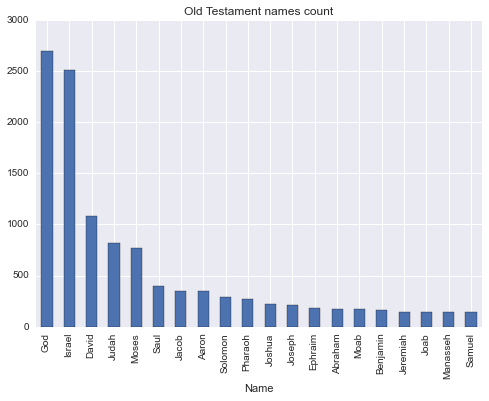
DataScience is not just applying some already written algorithms and plotting the results. The insight to the domain is required to make a valuable and meaningful decisions. Otherwise we could just use Amazon Machine Learning. Using this knowledge, we understand that two the most frequent names are 'God' and 'Israel' should be removed. 'God' is not really a name, even though there is a statistically insignificant number of babies with this name in US. Despite 'Israel' being a name, it's also a country, of which Old Testament is all about.
oldTestamentNamesCount = oldTestamentNamesCount.drop(oldTestamentNamesCount[(oldTestamentNamesCount.Name == 'God') | (oldTestamentNamesCount.Name == 'Israel')].index)
After the pre-processing stage, the analysis starts. We wanted to see the correlate of frequency occurrence, so for this we'll be using Pearson correlation by Pandas corr method and plotting the data using Seaborn package. Why? The Matplotlib package, despite being a great one, doesn't provide very easy to use interface to plotting a scatter plot with colored categories. So, to ease our life, we'll use another package which supports exactly that. Have a close look at the code in lines 7-9. Since scatter plot method requires 2 dimensional data, we have to make our data such, by removing and flattening the data using Pandas unstack and reset_index methods.
# scale and calculate plot states with high corr
def plotStateCorr(stateNamesCount, title):
    stateNamesCount[['Count','BibleCount']] = stateNamesCount[['Count','BibleCount']].apply(lambda x: MinMaxScaler().fit_transform(x))
    stateNamesCount = stateNamesCount.groupby(['Year', 'State']).corr()
    stateNamesCount = stateNamesCount[::2]
    highCorrStateNamesCount = stateNamesCount[stateNamesCount.Count > HIGH_CORR_THRESHOLD]
    highCorrStateNamesCount.drop(['BibleCount'], axis=1, inplace=True)
    highCorrStateNamesCount = highCorrStateNamesCount.unstack()
    highCorrStateNamesCount = highCorrStateNamesCount.reset_index()
    fg = sns.FacetGrid(data=highCorrStateNamesCount, hue='State', size=5)
    fg.map(pyplot.scatter, 'Year', 'Count').add_legend().set_axis_labels('Year', 'Correlation coefficient')
    sns.plt.title(title)

plotStateCorr(newTestamentStateNamesCount, 'Correlation of New Testament and US state names')
plotStateCorr(oldTestamentStateNamesCount, 'Correlation of Old Testament and US state names')
oldTestamentStateNamesCount = None
newTestamentStateNamesCount = None
stateNamesDS = None
Similar stages of pre-processing is done on national scale, without any particular interesting difference, so we'll be ending our discussing at this point. You can of course follow the Kaggle notebook code and explanation till the end.
Conclusion
NLP with the assistance of NLTK library, provides us with tools, which open a huge spectrum of possibilities to us, previously only available to linguists professionals. In this article we've taken a glimpse at what NLTK does, by using tokenization tools. In the next articles we'll cover other aspects of NLP.


