Sunday, April 10, 2016

NLP for Data Scientists - SpaCy


Introduction

It's been a while since we introduced new library, so today we'll talk a bit about SpaCy, which is an Natural Language Processing library for Python. Now, you'll say: Wait a minute, what about NLTK? Yes, both in Natural Language Processing with Python and Tweets analysis with Python and NLP we used NLTK, but from now on - no more. The reason couldn't be described better than in Spacy's author article about why he chose to write the library in the first place.

What NLTK has is a decent tokenizer, some passable stemmers, a good implementation of the Punkt sentence boundary detector, some visualization tools, and some wrappers for other libraries. Nothing else is of any use.

Installation

Starting to work with SpiCy is easy, first install it and then download the model data.

pip install scipy
python -m spacy.en.download

The rest is pretty straight forward, import the library and start using according to the documentation. Let's see how to use it's POS or Part of speech identifier.

import spacy

_spacy = spacy.load('en')
doc = _spacy("This is just an example")
for token in doc:
    print(str(token) + ": " + token.pos_)

# This: DET
# is: VERB
# just: ADV
# an: DET
# example: NOUN

After taking some time to load the models, which is of course done only once, the parsing is blazingly fast as opposed to NLTK bridge using Stanford POS tagger.

Conclusions

The reason I didn't show you the library before, was SpaCy was under dual licensing and I'm personally don't like to write articles about libraries with restrictions. However, now that's it under MIT License, feel free to throw NLTK and use SpaCY instead.

Friday, March 25, 2016

Optimizations of Gradient Descent


Introduction

Gradient Descent is one of the most popular technique to optimize machine learning algorithm. We've already discussed Gradient Descent in the past in Gradient descent with Python article, and gave some intuitions toward it's behaviour. We've also made an overview about choosing learning rate hyper-parameter for the algorithm in hyperparameter optimization article. So by now, you should have a fair understanding of how it works. Today we'll discuss different ways to optimize the performance of the algorithm itself.

Gradient Descent Variants

We've already three variants of the Gradient Descent in Gradient Descent with Python article: Batch Gradient Descent, Stochastic Gradient Descent and Mini-Batch Gradient Descent. What we haven't discussed was problems arising when using these techniques. Choosing a proper learning rate is difficult. A too small learning rate leads to tremendously slow convergence, while a very large learning rate that can cause the loss function to fluctuate around the minimum or even to diverge. Additionally, in all these variants of Gradient Descent the same learning rate applies to all parameter updates. However when the data is sparse with features having different frequencies, it would be better to perform a larger update for rarely occurring features.

Momentum

Gradient Descent struggles navigating ravines, areas where the surface curves much more steeply in one dimension than in another. Once fallen into ravine, Gradient Descent oscillates across the slopes of the ravine, without making much progress towards the local optimum. Momentum technique accelerates Gradient Descent in the relevant direction and lessens oscillations. In the illustrations below, the left one is vanilla Gradient Descent and the right is Gradient Descent with Momentum.

When Momentum technique is applied, the fraction of the update vector of the past time step is added to the current update vector:

The momentum parameter is usually set to 0.9

The idea behind using momentum accelerating speed of the ball as it rolls down the hill, until it reaches its terminal velocity if there is air resistance, that is our parameter . Similarly the momentum increases updates for dimensions whose gradients point in the same directions and reduces updates for dimensions whose gradients change directions gaining faster convergence while reducing oscillation.

Nesterov

The standard momentum method first computes the gradient at the current location and then takes a big jump in the direction of the updated accumulated gradient. The Nesterov accelerated gradient (NAG) looks ahead by calculating the gradient not by our current parameters but by approximating future position of our parameters. In the following illustration, instead of evaluating gradient at the current position (red circle), we know that our momentum is about to carry us to the tip of the green arrow. With Nesterov momentum we therefore instead evaluate the gradient at this "looked-ahead" position.

The formula for Nesterov accelerated gradient is as following with momentum parameter set to 0.9:

It enjoys stronger theoretical converge guarantees for convex functions and in practice it also consistently works slightly better than standard momentum.

Adagrad

All previous approaches we’ve discussed so far manipulated the learning rate globally and equally for all parameters. Adagrad is a well-suited algorithm for dealing with sparse data - it edits the learning rate to the parameters, performing larger updates for infrequent and smaller updates for frequent parameters. Adagrad uses a different learning rate for every parameter at each step, and not an update for all parameters at once and given by:

where is an element-wise multiplication, is a smoothing term that avoids division by zero (usually on the order of 1e−8), is a diagonal matrix of sum of the squares of the past gradients -

One of Adagrad's main benefits is that it eliminates the need to manually tune the learning rate. Most implementations use a default value of 0.01 and leave it at that.

Adadelta

Adadelta is an improvement over Adagrad which reduces its aggressiveness and monotonically decreasing learning rate. Instead of accumulating all past squared gradients, Adadelta restricts the window of accumulated past gradients to some fixed size .With Adadelta, we do not even need to set a default learning rate.

RMSprop

RMSprop also tries to overcome the diminishing learning rates of Adagrad and works similarly to Adadelta as following:

where E is a running average. RMSprop as well divides the learning rate by an exponentially decaying average of squared gradients. Momentum rate is usually set to 0.9, while a good default value for the learning rate is 0.001.

The following two animations provide some intuitions towards the optimization behaviour of the presented optimization algorithms on loss surface contours and saddle point:

It's clearly seen how standard SGD legs behind anyone else.

Conclusions

There is no right answer for choosing the correct optimization algorithm as SGD still holds the crown, while the others attempt to decrease learning rate dramatically sometimes sacrificing performance. In fact many papers use vanilla SGD without momentum. However, if you care about fast convergence you should choose one of the adaptive learning rate methods.

Wednesday, March 9, 2016

Tweets Analysis with Python and NLP


Introduction

You should be already familiar with the concepts of NLP from our previous post, so today we'll see more useful case of analysis the tweets and classifying them into marketing and non-marketing tweets. We won't get into details of tweets retrieval, this can be done with various packages with Tweepy being the most popular one.

Baseline

For the purpose of the discussion we already have 2 sets of tweets separated into files and are uploaded into GitHub folder. First we download the datasets, add target column as 1 for marketing tweets and unite the datasets. Then we'll check the baseline classification results, without any pre-processing. We do this so later we could understand whether our changes improve the metrics. We'll be using Random Forest for classification, since it doesn't expect linear features or even features that interact linearly and it can handle very well high dimensional spaces as well as large number of training examples. Plus it doesn't require a lot of configuration. Have a look at Random Forest and classifier boosting articles for more details.

# -*- coding: utf-8 -*-
import re
import numpy as np
import pandas as pd
from nltk.tokenize import WordPunctTokenizer
from sklearn.cross_validation import cross_val_predict
from sklearn.ensemble import RandomForestClassifier
from sklearn.feature_extraction.text import CountVectorizer
from sklearn.metrics import f1_score, accuracy_score, roc_auc_score

prefix = 'https://github.com/aie0/data/blob/master/tweets/'
badMarketingTweetsURL = prefix + 'bad_marketing_tweets.txt'
goodMarketingTweetsURL = prefix + 'good_non_marketing_tweets.txt'

vectorizer = CountVectorizer(max_features=5000)
tokenizer = WordPunctTokenizer()

# load ds
badMarketingTweetsDS = pd.read_csv(badMarketingTweetsURL, sep='\t',
                                   encoding='utf-8',
                                   names=['ID', 'Content'])
goodMarketingTweetsDS = pd.read_csv(goodMarketingTweetsURL, sep='\t',
                                    encoding='utf-8',
                                    names=['ID', 'Content'])

# marking target
badMarketingTweetsDS['isMarket'] = pd.Series(np.ones(len(badMarketingTweetsDS)),
                                             index=badMarketingTweetsDS.index)
goodMarketingTweetsDS['isMarket'] = pd.Series(np.zeros(len(goodMarketingTweetsDS)),
                                              index=goodMarketingTweetsDS.index)

X = badMarketingTweetsDS.append(goodMarketingTweetsDS)
y = X['isMarket']
X = X['Content']

def test_RF(transformator, options={}):
    tweets = transformator(X, options)
    features = vectorizer.fit_transform(tweets).toarray()

    y_pred = cross_val_predict(RandomForestClassifier(verbose=3,
                                                      n_estimators=100,
                                                      max_depth=10,
                                                      n_jobs=-1), features, y)
    acc = accuracy_score(y, y_pred)
    roc = roc_auc_score(y, y_pred)
    return acc, roc, f1


# 1. baseline
def transform_tweets1(tweets, options):
    return tweets

print(test_RF(transform_tweets1))
# (0.83827723901882489, 0.83818275302681977, 0.8342105263157894)
pass

Please notice the header of the file, # -*- coding: utf-8 -*-. Since tweets contain non-ascii characters, according to PEP 263, we should mark the file as such.

Our pipeline consists of 3 phases: pre-process the tweets (currently doing nothing), vectorizing the tweets and training the classifier using cross-validation to avoid overfitting. For details about cross-validation, read appropriate paragraph in linear regression article

We need vectorization since classifier cannot work with words and requires numeric vectors. To achieve the goal, we use scikit-learn CountVectorizer class, which implements bag of words technique.

Using no pre-processing we achieve 0.83 accuracy. Remember to check F1 and ROC metrics as well to spot skewed datasets, for more details see machine learning metrics article.

Pre-processing

Let's try several things to see what effect our changes have on the metrics.

def transform_tweets2(tweets, options):
    results = []
    length = len(tweets)
    i = 0
    for tweet in tweets:
        if i % 100 is 0:
            print("%d of %d\n" % (i, length))
        i += 1
        s = tweet.lower()

        if 'markEmoji' in options:
            try:
                s.decode('ascii')
            except:
                new_str = ''
                for l in s:
                    new_str += (" VGEMOJINAME " if ord(l) > 128 else l)
                s = new_str

        if 'patterns' in options:
            for (pattern, repl) in options['patterns']:
                s = re.sub(pattern, repl, s)

        words = tokenizer.tokenize(s)
        if 'remove_stop_words' in options:
            stops = set(stopwords.words("english"))
            result = " ".join([w for w in words if not w in stops])
        else:
            result = " ".join([w for w in words])
        results.append(result)
    return results

Removing stop words

We've all been taught that removing the stop words should the first step of any NLP pipeline. So that's only natural we start by doing so. The performance however not only hasn't improved, but actually showed a significant decline. Remember that we always should take into account the total number of instances when interpreting the performance, thus 0.834 - 0.822 = 0.012 decrease at 7000 instances is about 90 cases, which is a lot.

options = {
    'remove_stop_words': True
}
print(test_RF(transform_tweets2, options))
#(0.82943525385054195, 0.8290763420757612, 0.82242424242424241)

Marking links

Since removing the stop words didn't help, let's try something else - all links in tweeter are encoded, they don't provide any additional information and may only worsen the performance. Let's replace all links with hardcoded string VGLINKNAME. The performance increases by nearly 1 percent - good start!

replacement_patterns = [
    (r"http:\/\/t.co\/[a-zA-Z0-9]+", " VGLINKNAME ")
]
options = {
    'patterns': [(re.compile(regex), repl) for (regex, repl) in replacement_patterns]
}
print(test_RF(transform_tweets2, options))
#(0.84811751283513981, 0.84782082009277737, 0.85790527018012008)

Marking money

Marketing content usually contains monetary strings like "Win 100$". Let's try identify them and mark then with VGMONEYNAME. And the result - another percent up.

replacement_patterns = [
    (r"http:\/\/t.co\/[a-zA-Z0-9]+", " VGLINKNAME "), #link
    (r'\$\s{0,3}[0-9,]+', ' VGMONEYNAME ') # money
]
patterns = [(re.compile(regex), repl) for (regex, repl) in replacement_patterns]
options = {
    'patterns': [(re.compile(regex), repl) for (regex, repl) in replacement_patterns]
}
print(test_RF(transform_tweets2, options))
# (0.85667427267541363, 0.85637385309532066, 0.86601786428476202)

Marking Emojis

How about emotions? Do non-marketing emails contain more emotions through the use of Emojis signs? Let's try to create a feature around this idea by marking all non-ascii characters as VGEMOJINAME and check the results. Again the increase in performance by around half percent.

replacement_patterns = [
    (r"http:\/\/t.co\/[a-zA-Z0-9]+", " VGLINKNAME "), #link
    (r'\$\s{0,3}[0-9,]+', ' VGMONEYNAME ') #money
]
patterns = [(re.compile(regex), repl) for (regex, repl) in replacement_patterns]
options = {
    'patterns': [(re.compile(regex), repl) for (regex, repl) in replacement_patterns],
    'markEmoji': True
}
print(test_RF(transform_tweets2, patterns))
#(0.85853850541928122, 0.85730503637390198, 0.87023249526899159)

Conclusions

We can check more different ways to improve the performance, some will work, others won't. The main point you should take from this article is always rely on the data, never on what people say. Removing stop words may be a good idea in some domains and worsen the performance in others. Validate every assumption and play with the data as many as possible. Good luck!

Tuesday, February 23, 2016

Overview of Machine Learning Metrics

Introduction

One of the core tasks in building a machine learning model is to evaluate its performance. The usual data science pipeline consists of prototyping a model on some historical data, reaching a satisfying model and deploying it into production, where it will go through further testing on live data. The stages are usually called offline and online evaluations, where the former analyses prototyped model on historical data and the latter the deployed model on live data. Surprisingly to some, evaluation is really hard as good measurement are often vague or infeasible. Also generally statistical models assume that the distribution of data stays the same over time. But in practice, the distribution of data changes constantly, sometimes drastically. This is called distribution drift.

One way to detect distribution drift is to continue tracking the model’s performance on the validation metric on live data. That's why any data science project cannot just end after the model is written, simply because the model has to be re-evaluated and tweaked on regular basis.

Different machine learning tasks, require different metrics and there are various metrics for the tasks of classification, regression, ranking, clustering, topic modeling, etc.

Classification Metrics

We already know what classification is and have had numerous discussions about it using different algorithms. In the logistic regression article we even introduced some of the performance metrics used for classification. Let us add additional metrics besides ones described there: Accuracy, Precision, Recall, F1 and AUC.

Per-Class Accuracy

A variation of accuracy is the average per-class accuracy — the average of the accuracy for each class. Looking at the confusion matrix from the Wikipedia, one can clearly tell that the positive, or cat, class has higher accuracy: 5/(5+4) = 0.55, whereas dog's accuracy is: 2/(2+3)=0.4. In our example the average per-class accuracy would be (0.55 + 0.4)0/2 = 0.475. Note that in this case, the average per-class accuracy is quite different from the overall accuracy, which is (TN + TP)/(TN + TP + FN + FP) = (5+3)/(2+3+4+5) = 0.57. When the classes are imbalanced, meaning there are a much more examples of one class than the other, the accuracy will give a very skewed view, since the class with more observations will dominate the metric. In that case, we should look at the per-class accuracy, both the average and the individual per-class accuracy numbers.

Log-loss

Log-loss is a “soft” measurement of accuracy that incorporates the idea of probabilistic confidence. If the classifier calculates 0.51 probability belonging to class A, and thus assigning the observation to class A, then even though the classifier would be making a mistake, it’s a near miss because the probability is very close to the decision boundary of 0.5.

Log-loss is the cross entropy between the distribution of the true labels and the predictions. Intuitively speaking, entropy measures the unpredictability of something. By minimizing the cross entropy, we maximize the accuracy of the classifier.

Precision-Recall vs ROC Curves

ROC curves are commonly used to present results for binary decision problems in machine learning. However, when dealing with highly skewed datasets, Precision-Recall (PR) curves give a more informative picture of an algorithm’s performance. As a reminder to what precision and recall are, have a look at logistic regression article.

The performances of the Algorithms 1 and 2 appear to be comparable in ROC space in the image below (left), however, in PR space (right) we can see that Algorithm 2 has a clear advantage over Algorithm 1. This difference exists because in this domain the number of negative examples greatly exceeds the number of positives examples. Consequently, a large change in the number of false positives can lead to a small change in the false positive rate used in ROC analysis. Precision, on the other hand, by comparing false positives to true positives rather than true negatives, captures the effect of the large number of negative examples on the algorithm’s performance.

Regression Metrics

In linear regression article, we've slightly touched the regression metrics. Let's revise them.

RMSE

The most commonly used metric for regression tasks is root mean square error, or RMSE, also known as root mean square deviation, or RMSD, defined as the square root of the average squared distance between the actual score and the predicted one.

MAE

Mean absolute error, or MAE, measures the average magnitude of the errors in a set of forecasts, without considering their direction. It measures accuracy for continuous variables.

Since RMSE is an average, it is sensitive to large outliers. If the regressor performs really badly on a single data point, the average error could be very big. To spot this, MAE and the RMSE can be used together to diagnose the variation in the errors in a set of forecasts. The RMSE will always be larger or equal to the MAE; the greater the difference between them, the greater the variance in the individual errors in the sample.

R-squared

One of the problems with both RMSE and MAE is they are not bounded and different datasets yield different numbers for both of these metrics. Coefficient of determination, or R-squared, is a number that indicates how well data fit a statistical model – sometimes simply a line or a curve. A value of 1 indicates that the regression line perfectly fits the data, while 0 indicates that the line does not fit the data at all. The definition of R-squared uses sum of squares total, or SStot, and sum of squares residuals, or SSres metrics. The difference between SStot and SSres is the improvement in prediction from the regression model, compared to the mean model.

F-test

The F-test evaluates the null hypothesis that all regression coefficients are equal to zero versus the alternative that at least one does not. It compares a model with no predictors to the model that you specify. A regression model that contains no predictors is also known as an intercept-only model and it is equivalent to R-squared being zero. A significant F-test indicates that the observed R-squared is reliable, and is not a spurious result of oddities in the data set.

While R-squared provides an estimate of the strength of the relationship between your model and the response variable, it does not provide a formal hypothesis test for this relationship. The overall F-test determines whether this relationship is statistically significant.

Ranking Metrics

We haven't been discussing yet the topic of ranking, but the problem is very related to binary classification. In an underlying implementation, the classifier may assign a numeric score to each item instead of a categorical class label, and the ranker may simply order the items by the raw score. Since ranking is "sort of" classification, we use the same metrics applied there: Accuracy, Precision, Recall, F1 and AUC. Besides these, there is one additional ranking metric called Normalized Discounted Cumulative Gain or NDCG.

NDCG

Precision and recall treat all retrieved items equally; a relevant item in position k counts just as much as a relevant item in position 1. But this is not usually how people think. When we look at the results from a search engine, the top few answers matter much more than answers that are lower down on the list.

NDCG comes to rescue by introducing normalized version of discounted cumulative gain, or DCG, which discounts items that are further down the list. NDCG calculates a divided DCG by it's ideal score, so that the normalized score always lies between 0.0 and 1.0, where 1.0 representing the ideal ranking of the entities. This metric is commonly used in infomation retrieval and to evaluate the performance of web search engines algorithms, among them the most famous one - PageRank.

Conclusion

It’s easy to write down the formula of a metric, but it's completely different story to interpret the actual metric measured on real data. Always think about what the data looks like and how it affects the metric. In particular, always be on the look out for data skew. And never, never rely on one metric whether it's classification, regression or ranking problem.

Monday, February 8, 2016

Natural Language Processing with Python


Introduction

Natural language processing, or NLP, is a process of analyzing the text and extracting insights from it. It is used everywhere, from search engines such as Google or Bing, to voice interfaces such as Siri or Cortana. The pipeline usually involves tokenization, replacing and correcting words, part-of-speech tagging, named-entity recognition and classification. In this article we'll be describing tokenization, by using a full example from Kaggle notebook. The full code can be found on GitHub repository.


Installation

For the purposes of NLP, we'll be using NLTK Python library, a leading platform to work with human language data. It provides easy-to-use interfaces to over 50 corpora and lexical resources such as WordNet, along with a suite of text processing libraries for classification, tokenization, stemming, tagging, parsing, and semantic reasoning, wrappers for industrial-strength NLP libraries. Installing the package is easy using the Python package manager:

pip install nltk

Implementation

Let's walk through the Kaggle notebook and see that we understand what is done there. We'll be using already covered packages like Pandas, Scikit-Learn and Matplotlib. In addition we'll be using Seaborn, Python visualization library based on Matplotlib, which of course can be installed using the Python package manager:

pip install seaborn

The notebook analyzes the US baby names data between 1880 and 2014 and will be looking into questions how frequency occurrence of names in Bible correlate with US baby names. Firstly we'll load the data located in CSVs files, using Pandas read_csv method. To extract the names from the bible, the use of NLTK is done by taking advantage of nltk.tokenize package. Since we need all words staring with capital letter, we'll construct an appropriate regular expression rule. More about regular expression syntax can be found here.

nationalNamesDS = pd.read_csv(nationalNamesURL)
stateNamesDS = pd.read_csv(stateNamesURL)

bibleNamesDS = pd.read_csv(bibleNamesURL)
# retrieve all words starting with capital letter and having atleast length of 3
tokenizer = RegexpTokenizer("[A-Z][a-z]{2,}")
# load new testament
file = open(newTestamentURL)
bibleData = file.read()
file.close()
newTestamentWordsCount = pd.DataFrame(tokenizer.tokenize(bibleData))
.apply(pd.value_counts)

# load old testament
file = open(oldTestamentURL)
bibleData = file.read()
file.close()
oldTestamentWordsCount = pd.DataFrame(tokenizer.tokenize(bibleData))
.apply(pd.value_counts)

NLP is never used by itself and usually you'll want to some pre-processing prior to analyzing with text. Using Pandas drop and merge methods, we'll remove irrelevant columns and join the Bible capital words with known names from the Bible:

# remove irrelevant columns
stateNamesDS.drop(['Id', 'Gender'], axis=1, inplace=True)
nationalNamesDS.drop(['Id', 'Gender'], axis=1, inplace=True)

# retrieve unique names count of each testament
bibleNames = pd.Series(bibleNamesDS['Name'].unique())
# filtering out Bible names
newTestamentNamesCount = pd.merge(newTestamentWordsCount,
pd.DataFrame(bibleNames), right_on=0, left_index=True)
newTestamentNamesCount = newTestamentNamesCount.ix[:, 0:2]
newTestamentNamesCount.columns = ['Name', 'BibleCount']

oldTestamentNamesCount = pd.merge(oldTestamentWordsCount,
pd.DataFrame(bibleNames), right_on=0, left_index=True)
oldTestamentNamesCount = oldTestamentNamesCount.ix[:, 0:2]
oldTestamentNamesCount.columns = ['Name', 'BibleCount']

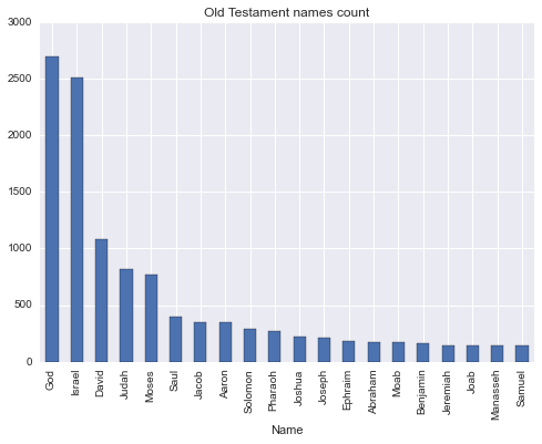
Great, now that we have our data, let's plot it with Matplotlib:

# plot top TOP_BIBLE_NAMES old testament names
topOldTestamentNamesCount = oldTestamentNamesCount.sort_values('BibleCount', ascending=False).head(TOP_BIBLE_NAMES)
topOldTestamentNamesCount.plot(kind='bar', x='Name', legend=False, title='Old Testament names count')

DataScience is not just applying some already written algorithms and plotting the results. The insight to the domain is required to make a valuable and meaningful decisions. Otherwise we could just use Amazon Machine Learning. Using this knowledge, we understand that two the most frequent names are 'God' and 'Israel' should be removed. 'God' is not really a name, even though there is a statistically insignificant number of babies with this name in US. Despite 'Israel' being a name, it's also a country, of which Old Testament is all about.

oldTestamentNamesCount = oldTestamentNamesCount.drop(oldTestamentNamesCount[(oldTestamentNamesCount.Name == 'God') | (oldTestamentNamesCount.Name == 'Israel')].index)

After the pre-processing stage, the analysis starts. We wanted to see the correlate of frequency occurrence, so for this we'll be using Pearson correlation by Pandas corr method and plotting the data using Seaborn package. Why? The Matplotlib package, despite being a great one, doesn't provide very easy to use interface to plotting a scatter plot with colored categories. So, to ease our life, we'll use another package which supports exactly that. Have a close look at the code in lines 7-9. Since scatter plot method requires 2 dimensional data, we have to make our data such, by removing and flattening the data using Pandas unstack and reset_index methods.

# scale and calculate plot states with high corr
def plotStateCorr(stateNamesCount, title):
    stateNamesCount[['Count','BibleCount']] = stateNamesCount[['Count','BibleCount']].apply(lambda x: MinMaxScaler().fit_transform(x))
    stateNamesCount = stateNamesCount.groupby(['Year', 'State']).corr()
    stateNamesCount = stateNamesCount[::2]
    highCorrStateNamesCount = stateNamesCount[stateNamesCount.Count > HIGH_CORR_THRESHOLD]
    highCorrStateNamesCount.drop(['BibleCount'], axis=1, inplace=True)
    highCorrStateNamesCount = highCorrStateNamesCount.unstack()
    highCorrStateNamesCount = highCorrStateNamesCount.reset_index()
    fg = sns.FacetGrid(data=highCorrStateNamesCount, hue='State', size=5)
    fg.map(pyplot.scatter, 'Year', 'Count').add_legend().set_axis_labels('Year', 'Correlation coefficient')
    sns.plt.title(title)

plotStateCorr(newTestamentStateNamesCount, 'Correlation of New Testament and US state names')
plotStateCorr(oldTestamentStateNamesCount, 'Correlation of Old Testament and US state names')
oldTestamentStateNamesCount = None
newTestamentStateNamesCount = None
stateNamesDS = None

Similar stages of pre-processing is done on national scale, without any particular interesting difference, so we'll be ending our discussing at this point. You can of course follow the Kaggle notebook code and explanation till the end.

Conclusion

NLP with the assistance of NLTK library, provides us with tools, which open a huge spectrum of possibilities to us, previously only available to linguists professionals. In this article we've taken a glimpse at what NLTK does, by using tokenization tools. In the next articles we'll cover other aspects of NLP.

Wednesday, January 27, 2016

SVM kernel approximation with Python


Introduction

A high-performance SVM classifier will likely need thousands of support vectors, and the resulting high complexity of classification prevents their use in many practical applications, with large numbers of training samples or large numbers of features in the input space. To handle this, several approximations to the RBF kernel (and similar kernels) have been devised. Typically, these take the form of a function z that maps a single vector to a vector of higher dimensionality, approximating the kernel.

where Phi is the implicit mapping embedded in the RBF kernel.

Implementation

Scikit-learn has already implemented Fourier transform and Nystroem approximation techniques using RBFSampler and Nystroem classes accordingly.

import matplotlib.pyplot as plt
import numpy as np
from sklearn import datasets, svm, pipeline
from sklearn.kernel_approximation import (RBFSampler, Nystroem)
# The digits dataset
digits = datasets.load_digits(n_class=9)

# To apply an classifier on this data, we need to flatten the image, to
# turn the data in a (samples, feature) matrix:
n_samples = len(digits.data)
data = digits.data / 16.
data -= data.mean(axis=0)

# We learn the digits on the first half of the digits
data_train, targets_train = data[:n_samples / 2], digits.target[:n_samples / 2]

# Now predict the value of the digit on the second half:
data_test, targets_test = data[n_samples / 2:], digits.target[n_samples / 2:]

# Create a classifier: a support vector classifier
kernel_svm = svm.SVC(gamma=.2)
linear_svm = svm.LinearSVC()

# create pipeline from kernel approximation
# and linear svm
feature_map_fourier = RBFSampler(gamma=.2, random_state=1)
feature_map_nystroem = Nystroem(gamma=.2, random_state=1)
fourier_approx_svm = pipeline.Pipeline([("feature_map", feature_map_fourier),
                                        ("svm", svm.LinearSVC())])

nystroem_approx_svm = pipeline.Pipeline([("feature_map", feature_map_nystroem),
                                        ("svm", svm.LinearSVC())])

# fit and predict using linear and kernel svm:
kernel_svm.fit(data_train, targets_train)
kernel_svm_score = kernel_svm.score(data_test, targets_test)

linear_svm.fit(data_train, targets_train)
linear_svm_score = linear_svm.score(data_test, targets_test)

sample_sizes = 30 * np.arange(1, 10)
fourier_scores = []
nystroem_scores = []
fourier_times = []
nystroem_times = []

for D in sample_sizes:
    fourier_approx_svm.set_params(feature_map__n_components=D)
    nystroem_approx_svm.set_params(feature_map__n_components=D)
    
    nystroem_approx_svm.fit(data_train, targets_train)
    fourier_approx_svm.fit(data_train, targets_train)

    fourier_score = fourier_approx_svm.score(data_test, targets_test)
    nystroem_score = nystroem_approx_svm.score(data_test, targets_test)
    nystroem_scores.append(nystroem_score)
    fourier_scores.append(fourier_score)

# plot the results:
accuracy = plt.figure(figsize=(8, 8))
accuracy = plt.subplot()
accuracy.plot(sample_sizes, nystroem_scores, label="Nystroem approx. kernel")
accuracy.plot(sample_sizes, fourier_scores, label="Fourier approx. kernel")
accuracy.plot([sample_sizes[0], sample_sizes[-1]],
              [linear_svm_score, linear_svm_score], label="linear svm")
accuracy.plot([sample_sizes[0], sample_sizes[-1]],
              [kernel_svm_score, kernel_svm_score], label="rbf svm")

# legends and labels
accuracy.set_title("Classification accuracy")
accuracy.set_xlim(sample_sizes[0], sample_sizes[-1])
accuracy.set_ylim(np.min(fourier_scores), 1)
accuracy.set_ylabel("Classification accuracy")
accuracy.legend(loc='best')

Take a look at score plot of different techniques, the more features we use the closer the approximation to original kernel. And since the whole point of approximation was to use it on large number of features, this is exactly what we want to achieve.

Conclusion

SVM kernel approximation can dramatically speed up the prediction process with minimal accuracy loss, enabling the usage of SVM in production resource limited systems.

Friday, January 8, 2016

Anomaly detection with Python


Introduction

The goal of anomaly detection is to identify cases that are unusual within data that is seemingly homogeneous. Anomaly detection is an important tool for detecting fraud, network intrusion, and other rare events that may have great significance but are hard to find.

Outliers are cases that are unusual because they fall outside the distribution that is considered normal for the data. The distance from the center of a normal distribution indicates how typical a given point is with respect to the distribution of the data. Each case can be ranked according to the probability that it is either typical or atypical.

Anomaly detection is a form of classification and is implemented as one-class classification, because only one class is represented in the training data. An anomaly detection model predicts whether a data point is typical for a given distribution or not. An atypical data point can be either an outlier or an example of a previously unseen class. Normally, a classification model must be trained on data that includes both examples and counter-examples for each class so that the model can learn to distinguish between them.

Implementation

Scikit-learn implements One-class SVM algorithm, which detects the soft boundary of that set so as to classify new points as belonging to that set or not. The class that implements this is called OneClassSVM.

import numpy as np
import matplotlib.pyplot as plt
import matplotlib.font_manager
from sklearn import svm

# Generate train data
X = 0.3 * np.random.randn(100, 2)
X_train = np.r_[X + 2, X - 2]
# Generate some regular novel observations
X = 0.3 * np.random.randn(20, 2)
X_test = np.r_[X + 2, X - 2]
# Generate some abnormal novel observations
X_outliers = np.random.uniform(low=-4, high=4, size=(20, 2))

# fit the model
clf = svm.OneClassSVM(nu=0.1, kernel="rbf", gamma=0.1)
clf.fit(X_train)
y_pred_train = clf.predict(X_train)
y_pred_test = clf.predict(X_test)
y_pred_outliers = clf.predict(X_outliers)
n_error_train = y_pred_train[y_pred_train == -1].size
n_error_test = y_pred_test[y_pred_test == -1].size
n_error_outliers = y_pred_outliers[y_pred_outliers == 1].size

# plot the line, the points, and the nearest vectors to the plane
xx, yy = np.meshgrid(np.linspace(-5, 5, 500), np.linspace(-5, 5, 500))
Z = clf.decision_function(np.c_[xx.ravel(), yy.ravel()])
Z = Z.reshape(xx.shape)

plt.title("Novelty Detection")
plt.contourf(xx, yy, Z, levels=np.linspace(Z.min(), 0, 7), cmap=plt.cm.Blues_r)
a = plt.contour(xx, yy, Z, levels=[0], linewidths=2, colors='red')
plt.contourf(xx, yy, Z, levels=[0, Z.max()], colors='orange')

b1 = plt.scatter(X_train[:, 0], X_train[:, 1], c='white')
b2 = plt.scatter(X_test[:, 0], X_test[:, 1], c='green')
c = plt.scatter(X_outliers[:, 0], X_outliers[:, 1], c='red')
plt.axis('tight')
plt.xlim((-5, 5))
plt.ylim((-5, 5))
plt.legend([a.collections[0], b1, b2, c],
           ["learned frontier", "training observations",
            "new regular observations", "new abnormal observations"],
           loc="upper left",
           prop=matplotlib.font_manager.FontProperties(size=11))
plt.xlabel(
    "error train: %d/200 ; errors novel regular: %d/40 ; "
    "errors novel abnormal: %d/40"
    % (n_error_train, n_error_test, n_error_outliers))
plt.show()

Since we only have one category, normal points are marked by 1 and outliners are marked by -1.

Conclusion

Anomaly detection is applicable in a variety of domains, such as intrusion detection, fraud detection, fault detection, system health monitoring, event detection in sensor networks, and detecting Eco-system disturbances. It is often used in preprocessing to remove anomalous data from the dataset. In supervised learning, removing the anomalous data from the dataset often results in a statistically significant increase in accuracy.

Monday, December 28, 2015

K-nearest Neighbors (KNN) in Python


Introduction

Neighbors-based classification is a type of instance-based learning or non-generalizing learning: it does not attempt to construct a general internal model, but simply stores instances of the training data. Classification is computed from a simple majority vote of the nearest neighbors of each point: a query point is assigned the data class which has the most representatives within the nearest neighbors of the point.


Implementation

scikit-learn implements two different nearest neighbors classifiers: KNeighborsClassifier implements learning based on the k nearest neighbors of each query point, where k is an integer value specified by the user. RadiusNeighborsClassifier implements learning based on the number of neighbors within a fixed radius r of each training point, where r is a floating-point value specified by the user.

import numpy as np
import matplotlib.pyplot as plt
from matplotlib.colors import ListedColormap
from sklearn import neighbors, datasets

n_neighbors = 15

# import some data to play with
iris = datasets.load_iris()
X = iris.data[:, :2]  # we only take the first two features.
y = iris.target

h = .02  # step size in the mesh

# Create color maps
cmap_light = ListedColormap(['#FFAAAA', '#AAFFAA', '#AAAAFF'])
cmap_bold = ListedColormap(['#FF0000', '#00FF00', '#0000FF'])

# we create an instance of Neighbours Classifier and fit the data.
clf = neighbors.KNeighborsClassifier(n_neighbors)
clf.fit(X, y)

# Plot the decision boundary. For that, we will assign a color to each
# point in the mesh [x_min, m_max]x[y_min, y_max].
x_min, x_max = X[:, 0].min() - 1, X[:, 0].max() + 1
y_min, y_max = X[:, 1].min() - 1, X[:, 1].max() + 1
xx, yy = np.meshgrid(np.arange(x_min, x_max, h),
                     np.arange(y_min, y_max, h))
Z = clf.predict(np.c_[xx.ravel(), yy.ravel()])

# Put the result into a color plot
Z = Z.reshape(xx.shape)
plt.figure()
plt.pcolormesh(xx, yy, Z, cmap=cmap_light)

# Plot also the training points
plt.scatter(X[:, 0], X[:, 1], c=y, cmap=cmap_bold)
plt.xlim(xx.min(), xx.max())
plt.ylim(yy.min(), yy.max())

plt.show()

Now let's see how RadiusNeighborsClassifier works. After playing a bit with hyperparameters, we'll achieve the following plot:

...
clf = neighbors.RadiusNeighborsClassifier(3.0, weights='distance')
...

Conclusion

Despite its simplicity, nearest neighbors has been successful in a large number of classification and regression problems, including handwritten digits or satellite image scenes. Being a non-parametric method, it is often successful in classification situations where the decision boundary is very irregular.

Thursday, December 3, 2015

Classifier Boosting with Python


Introduction

Remember we've talked about random forest and how it was used to improve the performance of a single Decision Tree classifier. The idea of fitting a number of decision tree classifiers on various sub-samples of the dataset and using averaging to improve the predictive accuracy can be used to other algorithms as well and it's called boosting. There are several boosting techniques, which can be used to improve our algorithm, we'll cover the most used ones: AdaBoost and Bagging boost.

AdaBoost

An AdaBoost classifier begins by fitting a classifier on the original dataset and then fits additional copies of the classifier on the same dataset, but where the weights of incorrectly classified instances are adjusted such that subsequent classifiers focus more on difficult cases.

Bagging boost

A Bagging classifier fits base classifiers each on random subsets of the original dataset and then aggregate their individual predictions to form a final prediction.

Implementation

All boosting methods are located under sklearn.ensemble module. Let's see first how to boost SVM using bagging classifier.

import numpy as np
import matplotlib.pyplot as plt
from sklearn.ensemble import BaggingClassifier
from sklearn.datasets import make_gaussian_quantiles
from sklearn.svm import SVC

# Construct dataset
X1, y1 = make_gaussian_quantiles(cov=2.,
                                 n_samples=200, n_features=2,
                                 n_classes=2, random_state=1)
X2, y2 = make_gaussian_quantiles(mean=(3, 3), cov=1.5,
                                 n_samples=300, n_features=2,
                                 n_classes=2, random_state=1)
X = np.concatenate((X1, X2))
y = np.concatenate((y1, - y2 + 1))

# Create and fit an boosted svm
bdt = BaggingClassifier(SVC())

bdt.fit(X, y)

plot_colors = "br"
plot_step = 0.02
class_names = "AB"

plt.figure(figsize=(10, 5))

# Plot the decision boundaries
x_min, x_max = X[:, 0].min() - 1, X[:, 0].max() + 1
y_min, y_max = X[:, 1].min() - 1, X[:, 1].max() + 1
xx, yy = np.meshgrid(np.arange(x_min, x_max, plot_step),
                     np.arange(y_min, y_max, plot_step))

Z = bdt.predict(np.c_[xx.ravel(), yy.ravel()])
Z = Z.reshape(xx.shape)
cs = plt.contourf(xx, yy, Z, cmap=plt.cm.Paired)
plt.axis("tight")

# Plot the training points
for i, n, c in zip(range(2), class_names, plot_colors):
    idx = np.where(y == i)
    plt.scatter(X[idx, 0], X[idx, 1],
                c=c, cmap=plt.cm.Paired,
                label="Class %s" % n)
plt.xlim(x_min, x_max)
plt.ylim(y_min, y_max)
plt.legend(loc='upper right')
plt.xlabel('x')
plt.ylabel('y')
plt.title('Decision Boundary')

Now, let's change the line 18th to AdaBoost and Decision Tree

from sklearn.ensemble import AdaBoostClassifier
from sklearn.tree import DecisionTreeClassifier
...
bdt = AdaBoostClassifier(DecisionTreeClassifier(max_depth=1), algorithm="SAMME", n_estimators=200)
...

Conclusion

Boosting techniques may dramatically improve the base algorithm and serve an irreplaceable tool in any data scientists toolkit.

Thursday, November 19, 2015

K-means clustering with Python


Introduction

K-means is one of the simplest unsupervised learning algorithms that solve the well known clustering problem. The procedure follows a simple and easy way to classify a given data set through a certain K number of clusters. The main idea is to define K centroids, one for each cluster. The next step is to take each point belonging to a given data set and associate it to the nearest centroid. At this point we need to re-calculate K new centroids of the clusters resulting from the previous step. After we have these K new centroids, a new binding has to be done between the same data set points and the nearest new centroid. As a result of this loop we may notice that the K centroids change their location step by step until no more changes are done.

Implementation

Scikit-learn provides with full implementation of K-means algorithm though KMeans class. Let's have a look at several interesting situations, which might occur during data clustering:

import numpy as np
import matplotlib.pyplot as plt
from sklearn.cluster import KMeans
from sklearn.datasets import make_blobs

plt.figure(figsize=(12, 12))

n_samples = 1500
random_state = 170
X, y = make_blobs(n_samples=n_samples, random_state=random_state)

# Incorrect number of clusters
y_pred = KMeans(n_clusters=2, random_state=random_state).fit_predict(X)

plt.subplot(221)
plt.scatter(X[:, 0], X[:, 1], c=y_pred)
plt.title("Incorrect Number of Blobs")

# Anisotropicly distributed data
transformation = [[ 0.60834549, -0.63667341], [-0.40887718, 0.85253229]]
X_aniso = np.dot(X, transformation)
y_pred = KMeans(n_clusters=3, random_state=random_state).fit_predict(X_aniso)

plt.subplot(222)
plt.scatter(X_aniso[:, 0], X_aniso[:, 1], c=y_pred)
plt.title("Anisotropicly Distributed Blobs")

# Different variance
X_varied, y_varied = make_blobs(n_samples=n_samples,
                                cluster_std=[1.0, 2.5, 0.5],
                                random_state=random_state)
y_pred = KMeans(n_clusters=3, random_state=random_state).fit_predict(X_varied)

plt.subplot(223)
plt.scatter(X_varied[:, 0], X_varied[:, 1], c=y_pred)
plt.title("Unequal Variance")

# Unevenly sized blobs
X_filtered = np.vstack((X[y == 0][:500], X[y == 1][:100], X[y == 2][:10]))
y_pred = KMeans(n_clusters=3, random_state=random_state).fit_predict(X_filtered)

plt.subplot(224)
plt.scatter(X_filtered[:, 0], X_filtered[:, 1], c=y_pred)
plt.title("Unevenly Sized Blobs")

plt.show()

At first we wrongly assume that there are 3 clusters in the data and make K-means find them. Later we transform the data anisotropicly. Since K-means uses Euclidian distance to to associate points to clusters, it does not work well with non-globular clusters. The last two datasets introduce blobs of different variance and size, but this makes no difference and the classification succeeds.

Conclusion

K-means provides us with easy to use clustering algorithms. It's fast, easy to follow and is used vastly in various fields including Vector Quantization.

Sunday, November 8, 2015

Naïve Bayes with Python


Introduction

The Naive Bayes algorithm is based on conditional probabilities. It uses Bayes' Theorem, a formula that calculates a probability by counting the frequency of values and combinations of values in the historical data. Bayes' Theorem finds the probability of an event occurring given the probability of another event that has already occurred. If B represents the dependent event and A represents the prior event, Bayes' theorem can be stated as follows. To calculate the probability of B given A, the algorithm counts the number of cases where A and B occur together and divides it by the number of cases where A occurs alone.

Implementation

Scikit-learn provides implementation of Naïve Bayes algorithm of 3 flavors: MultinomialNB implementing the naive Bayes algorithm for multinomially distributed data; GaussianNB implementing the Gaussian Naive Bayes algorithm for classification; and BernoulliNB implements the naive Bayes training and classification algorithms for data that is distributed according to multivariate Bernoulli distributions.

Let's take a look at Naïve Bayes algorithm at work classifying Iris data and since anything the nature produces is distributed according to a Gaussian distribution, we'll be using this appropriate class

import numpy as np
import matplotlib.pyplot as plt
from sklearn.datasets import load_iris
from sklearn.naive_bayes import GaussianNB
 
# Parameters
n_classes = 3
plot_colors = "bry"
plot_step = 0.02
plt.rcParams["figure.figsize"] = [12, 8]
 
# Load data
iris = load_iris()
 
for pairidx, pair in enumerate([[0, 1], [0, 2], [0, 3],
                                [1, 2], [1, 3], [2, 3]]):
    # We only take the two corresponding features
    X = iris.data[:, pair]
    y = iris.target
 
    # Shuffle
    idx = np.arange(X.shape[0])
    np.random.seed(13)
    np.random.shuffle(idx)
    X = X[idx]
    y = y[idx]
 
    # Train
    clf = GaussianNB().fit(X, y)
 
    # Plot the decision boundary
    plt.subplot(2, 3, pairidx + 1)
 
    x_min, x_max = X[:, 0].min() - 1, X[:, 0].max() + 1
    y_min, y_max = X[:, 1].min() - 1, X[:, 1].max() + 1
    xx, yy = np.meshgrid(np.arange(x_min, x_max, plot_step),
                         np.arange(y_min, y_max, plot_step))
 
    Z = clf.predict(np.c_[xx.ravel(), yy.ravel()])
    Z = Z.reshape(xx.shape)
    cs = plt.pcolormesh(xx, yy, Z, cmap=plt.cm.Paired)
 
    plt.xlabel(iris.feature_names[pair[0]])
    plt.ylabel(iris.feature_names[pair[1]])
    plt.axis()
 
    # Plot the training points
    for i, color in zip(range(n_classes), plot_colors):
        idx = np.where(y == i)
        plt.scatter(X[idx, 0], X[idx, 1], c=color,
                    label=iris.target_names[i],
                    cmap=plt.cm.Paired)
    plt.axis()
 
plt.legend(loc="upper left")
plt.show()

Pretty cool, isn't it!

Conclusion

The Naive Bayes algorithm affords fast, highly scalable model building and scoring. It scales linearly with the number of predictors and rows. You'll need, however, a big data set in order to make reliable estimations of the probability of each class. You can use Naïve Bayes classification algorithm with a small data set, but precision and recall will keep very low. For small reminder about what those are, have a look at performance metrics section here.

Tuesday, October 27, 2015

Python for Data Scientists - Rodeo

Introduction

I love Python, I really do and that goes for IPython as well - it's a great tool and simplifies the work by a lot. But.. there is always a but, isn't it? RStudio is so much better and until recently we, the Python data enthusiasts, could only nervously look at RStudio while working on somewhat beloved, somewhat limped brother IPython. Well, no more. Let me introduce you Rodeo

The IDE is free and super easy to use, it's very similar to RStudio and after you watch the introduction video above, you'll be ready to go.

Wednesday, October 7, 2015

Random Forest with Python


Introduction

In the article about decision tree we've talked about it's drawbacks of being sensitive to small variations or noise in the data. Today we'll see how to deal with them by introducing a random forest. It belongs to a larger class of machine learning algorithms called ensemble methods, which use multiple learning algorithms to obtain better predictive performance than could be obtained from any of the constituent learning algorithms. So which models does random forest aggregate? You might already know the answer - the decision trees. It fits a number of decision tree classifiers on various sub-samples of the dataset and use averaging to improve the predictive accuracy and control over-fitting.

Implementation

Scikit-learn provides us with two classes RandomForestClassifier and RandomForestRegressor for classification and regression problems respectively. Let's use the code from the previous example and see how the result will different, using random forest with 100 trees.

...
clf = RandomForestClassifier(n_estimators=100).fit(X, y)
...

As you can see the edges are much smoother, that is less overfitted, than using a single decision tree.

Conclusion

Despite it's relative simplicity, random forest performs the job remarkably well. According to empirical comparisons, even better than SVMs.

Monday, September 28, 2015

Decision Tree with Python


Introduction

Last time we talked about non-linear classifier using Support Vector Machines or SVM. Today we'll be discussing another non-linear classifier and regressor called decision tree. The way decision tree works is by creating a model, which predicts the value of a target variable by learning simple decision rules inferred from the data features.

Since trees can be visualized and is something we're all used to, decision trees can easily be explained, visualized and manipulated the non-linearity in an intuitive manner. Surely there are some disadvantages as well, but we'll note them a bit later, firstly let's see them in action.

Implementation

It won't come as a complete surprise to you, that scikit package has already taken initiative and implemented the whole thing using DecisionTreeRegressor and DecisionTreeClassifier classes. What is left for us is to bear the fruits of someone else's hard labour.

import StringIO
import numpy as np
import matplotlib.pyplot as plt
import pydot
from IPython.display import Image
from sklearn import tree
from sklearn.datasets import load_iris
from sklearn.tree import DecisionTreeClassifier

# Parameters
n_classes = 3
plot_colors = "bry"
plot_step = 0.02
plt.rcParams["figure.figsize"] = [12, 8]

# Load data
iris = load_iris()

for pairidx, pair in enumerate([[0, 1], [0, 2], [0, 3],
                                [1, 2], [1, 3], [2, 3]]):
    # We only take the two corresponding features
    X = iris.data[:, pair]
    y = iris.target

    # Shuffle
    idx = np.arange(X.shape[0])
    np.random.seed(13)
    np.random.shuffle(idx)
    X = X[idx]
    y = y[idx]

    # Standardize
    mean = X.mean(axis=0)
    std = X.std(axis=0)
    X = (X - mean) / std

    # Train
    clf = DecisionTreeClassifier().fit(X, y)

    # Plot the decision boundary
    plt.subplot(2, 3, pairidx + 1)

    x_min, x_max = X[:, 0].min() - 1, X[:, 0].max() + 1
    y_min, y_max = X[:, 1].min() - 1, X[:, 1].max() + 1
    xx, yy = np.meshgrid(np.arange(x_min, x_max, plot_step),
                         np.arange(y_min, y_max, plot_step))

    Z = clf.predict(np.c_[xx.ravel(), yy.ravel()])
    Z = Z.reshape(xx.shape)
    cs = plt.pcolormesh(xx, yy, Z, cmap=plt.cm.Paired)

    plt.xlabel(iris.feature_names[pair[0]])
    plt.ylabel(iris.feature_names[pair[1]])
    plt.axis()

    # Plot the training points
    for i, color in zip(range(n_classes), plot_colors):
        idx = np.where(y == i)
        plt.scatter(X[idx, 0], X[idx, 1], c=color,
                    label=iris.target_names[i],
                    cmap=plt.cm.Paired)
    plt.axis()

plt.legend(loc="upper left")
plt.show()

First we normalize the data and then draw decision boundaries and at last the data itself.

Take a look at the first subplot and let's compare it with one, where we used logistic regression. Back then we couldn't classify the data using these features, now using the decision tree we surely can.

Visualization

Since decision tree uses a tree data-structure, wouldn't it be cool to visualize it.
Notice: You'll need to install GraphViz package to run this example

...
dot_data = StringIO.StringIO()  
tree.export_graphviz(clf, out_file=dot_data,  
                     feature_names=iris.feature_names,  
                     class_names=iris.target_names,  
                     filled=True, rounded=True,  
                     special_characters=True)  
graph = pydot.graph_from_dot_data(dot_data.getvalue())  
Image(graph.create_png())

Now, when we have our tree in place, let's see how the decisions were made with Gini coefficient attached to each node. What Gini coefficient measures is the inequality among values of a frequency distribution, in our case iris species. A Gini coefficient of zero expresses perfect equality, where all values are the same - all iris are of the same species.

So the first check is against septal length being lesser than -0.7442, and from Gini coefficient 0.6667 we can deduce that it splits the data with one third going into a single category, setosa. The process continues until we reach Gini coefficient 0, that is the remaining data is of a single category.

Conclusion

One of the notable advantages of using decision trees is it's prediction performance, which is logarithmic in the number of data points used to train the tree. But there is are some downsides as well, which are needed to be considered as well. The first one is can be seen from our first subplot example - overfitting. Trees tend to perform incredibly well at the top, but at the same time tend to overfit at the bottom. This is a major downsite and therefore trees should be pruned! Also decision trees can be unstable because small variations or noise in the data might result in a completely different tree being generated. However this problem is mitigated by using decision trees within an ensemble, of which we'll talk next time.

Tuesday, September 8, 2015

Support Vector Machines with Python


Introduction

Having learnt different optimization and classification methods, you must feel quit confident to start exploring the datasets of interest. However you might very quickly run into a dataset, which no matter how hyper-parameters are set, is just not linearly separable. Surely there is no place for despair, especially since we have just a classifier to deal with these situation, called Support Vector Machine.

How it works

Support Vector Machine, or SVM, are a set of supervised learning methods used for classification and with a slight change for regression. The core idea of it is to linearly separate the hyper-space of features. The prefix hyper is not occasional, as SVM increases the dimension of feature space to achieve it's goal. The power of the method comes from using kernel functions, which enable it to operate in a high-dimensional, implicit feature space without ever computing the coordinates of the data in that space, but rather by simply computing the inner products between the images of all pairs of data in the feature space. This operation is often computationally cheaper than the explicit computation of the coordinates, thus allowing SVM to operate on datasets with much bigger feature space, like image recognition. Consider the following example:

There's no linear decision boundary for this dataset, which will separate observations of two classes. If you apply linear classifier, you'll just receive an "arbitrary" line throughout the space crossing both of the classes - you just cannot do it correctly with logistic regression.

The way SVM approaches the problem, is by augmenting the dataset with additional dimensions and trying to maximize the margin between the classes. It places the separation so that the distance to closest misclassified entity is the widest. Have a look at the following illustration depicting the process:

Applying a kernel function, it transforms the observations to a space, where they can be linearly separable, resulting the following separation:

Implementation

It won't come as a big surprise to you, that scikit-learn has a fully implemented and optimized SVM support, so let's have a look how it deals with various situations. We'll create three demo datasets, one in shape of moons, one of circles and the last will contain linearly separable observations. Then we'll apply SVM with two different kernel functions: linear and radial based function. In the end we'll plot the observations and color the background according to distance from boundary hyperplane using diverging palette, that is the farther it's from center the darker the color (red or blue depending on the sign). Take a closer look into the example code and make sure you understand the process.

import numpy as np
import matplotlib.pyplot as plt
from matplotlib.colors import ListedColormap
from sklearn.cross_validation import train_test_split
from sklearn.preprocessing import StandardScaler
from sklearn.datasets import make_moons, make_circles, make_classification
from sklearn.svm import SVC

h = .02  # step size in the mesh
names = ["Linear SVM", "RBF SVM"]
classifiers = [
    SVC(kernel="linear", C=0.025),
    SVC(gamma=2, C=1)]

X, y = make_classification(n_features=2, n_redundant=0,
        random_state=1, n_clusters_per_class=1)
rng = np.random.RandomState(2)
X += rng.uniform(size=X.shape)
linearly_separable = (X, y)

datasets = [make_moons(noise=0.3, random_state=0),
            make_circles(noise=0.2, factor=0.5, random_state=1),
            linearly_separable
            ]

figure = plt.figure(figsize=(9, 9))
i = 1
# iterate over datasets
for ds in datasets:
    # preprocess dataset, split into training and test part
    X, y = ds
    X = StandardScaler().fit_transform(X)
    X_train, X_test, y_train, y_test = train_test_split(X, y,
      test_size=0.4)

    x_min, x_max = X[:, 0].min() - .5, X[:, 0].max() + .5
    y_min, y_max = X[:, 1].min() - .5, X[:, 1].max() + .5
    xx, yy = np.meshgrid(np.arange(x_min, x_max, h),
                         np.arange(y_min, y_max, h))

    # just plot the dataset first
    cm = plt.cm.RdBu
    cm_bright = ListedColormap(['#FF0000', '#0000FF'])
    ax = plt.subplot(len(datasets), len(classifiers) + 1, i)
    # Plot the training points
    ax.scatter(X_train[:, 0], X_train[:, 1], c=y_train,
      cmap=cm_bright)
    # and testing points
    ax.scatter(X_test[:, 0], X_test[:, 1], c=y_test,
      cmap=cm_bright, alpha=0.6)
    ax.set_xlim(xx.min(), xx.max())
    ax.set_ylim(yy.min(), yy.max())
    ax.set_xticks(())
    ax.set_yticks(())
    i += 1

    # iterate over classifiers
    for name, clf in zip(names, classifiers):
        ax = plt.subplot(len(datasets), len(classifiers) + 1, i)
        clf.fit(X_train, y_train)
        score = clf.score(X_test, y_test)

        # Plot the decision boundary. We'll assign a color to
        # each point in the mesh [x_min, m_max]x[y_min, y_max].
        Z = clf.decision_function(np.c_[xx.ravel(), yy.ravel()])

        # Put the result into a color plot
        Z = Z.reshape(xx.shape)
        ax.contourf(xx, yy, Z, cmap=cm, alpha=.8)

        # Plot also the training points
        ax.scatter(X_train[:, 0], X_train[:, 1], c=y_train,
          cmap=cm_bright)
        # and testing points
        ax.scatter(X_test[:, 0], X_test[:, 1], c=y_test,
          cmap=cm_bright, alpha=0.6)

        ax.set_xlim(xx.min(), xx.max())
        ax.set_ylim(yy.min(), yy.max())
        ax.set_xticks(())
        ax.set_yticks(())
        ax.set_title(name)
        ax.text(xx.max() - .3, yy.min() + .3, 
          ('%.2f' % score).lstrip('0'), size=15, horizontalalignment='right')
        i += 1

plt.show()

The results, as anticipated, are much more promising than using a linear classifier. For moon and circle shaped datasets, there is tremendous increase classification score, where as for linearly separable observations the result doesn't change. This is of course understandable as linearly separable dataset can be easily dealt with using linear classifier.

Conclusion

SVM is a powerful tool, however from a practical point of view perhaps the most serious problem with SVMs is the high algorithmic complexity and extensive memory requirements of the required quadratic with the number of samples, which makes it hard to scale to dataset with more than a couple of 10000 samples.