Introduction
Sure, with both pandas and SciPy you can perform some superb data analysis. And with the IPython, working sure became much easier. But how about presenting your results? Today we'll talk about Matplotlib - our presentation package.
Making plots and static or interactive visualizations is one of the most important tasks in data analysis. It may be a part of the exploratory process; for example, helping identify outliers, needed data transformations, or coming up with ideas for models.
Installation
Installation of matplotlib is easy. If don't have it preinstalled as part of your Python distribution, just do it manually using python package manager
pip install matplotlib
Usage
Since we're already familiar with IPython, I'll be only covering it's usage as this is a preferable way of writing data analysis procedures. In console mode graphs are plotted in a separate newly created window, each time you render a plot. In web mode, it's better to put the graphs inside the document, along with it's code and possible documentation. To achieve this, one must add the following line in the beginning of the code.
%matplotlib inline
Examples
Let's walk through several graph examples for you to acquire a taste of what Matplotlib is all about.
Bar Chart
%matplotlib inline
import numpy as np
import matplotlib.pyplot as plt

N = 5
ind = np.arange(N)  # the x locations for the groups
width = 0.35       # the width of the bars

# render men data bar charts with std candle
menMeans = (20, 35, 30, 35, 27)
menStd =   (2, 3, 4, 1, 2)
rects1 = plt.bar(ind, menMeans, width, color='r', yerr=menStd)

# render women data bar charts with std candle
womenMeans = (25, 32, 34, 20, 25)
womenStd =   (3, 5, 2, 3, 3)
rects2 = plt.bar(ind+width, womenMeans, width, color='y', yerr=womenStd)

# add legend
plt.legend( (rects1[0], rects2[0]), ('Men', 'Women') )

# label bars
def autolabel(rects):
    # attach some text labels
    for rect in rects:
        height = rect.get_height()
        plt.text(rect.get_x()+rect.get_width()/2., 1.05*height, '%d'%int(height),
                ha='center', va='bottom')

autolabel(rects1)
autolabel(rects2)

# add some text for labels, title and axes ticks
ax = plt.gca()
ax.set_ylabel('Scores')
ax.set_title('Scores by group and gender')
ax.set_xticks(ind+width)
ax.set_xticklabels( ('G1', 'G2', 'G3', 'G4', 'G5') )

plt.show()    # show the plot

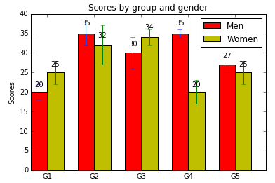
As you can see to render a bar chart is not that big of a deal and the code with some comments is fairly self-explanatory.
The interesting part is the way we drew standard deviation candles, through yerr parameter. The optional arguments color, edgecolor, linewidth, xerr, and yerr can be either scalars or sequences of length equal to the number of bars.
Pie Chart
Let's take a look at some more interesting charts, like pie chart with an exploding slice:
# The slices will be ordered and plotted counter-clockwise.
labels = 'Frogs', 'Hogs', 'Dogs', 'Logs'
sizes = [15, 30, 45, 10]
colors = ['yellowgreen', 'gold', 'lightskyblue', 'lightcoral']
explode = (0, 0.1, 0, 0) # only "explode" the 2nd slice (i.e. 'Hogs')

plt.pie(sizes, explode=explode, labels=labels, colors=colors,
        autopct='%1.1f%%', shadow=True, startangle=90)
# Set aspect ratio to be equal so that pie is drawn as a circle.
plt.axis('equal')

plt.show()
Sub Plots
Sometimes you need to render several plots in one graph. Matplotlib has a notion of subplot, which does exactly this. To do this use the function subplot, which receives number of rows, number of cols and plot number, which is used to identify the particular subplot that this function is to create within the notional grid. Plot number starts at 1, increments across rows first and has a maximum of rows * cols.
x1 = np.linspace(0.0, 5.0)
x2 = np.linspace(0.0, 2.0)

y1 = np.cos(2 * np.pi * x1) * np.exp(-x1)
y2 = np.cos(2 * np.pi * x2)

plt.subplot(2, 1, 1) # # reference 1st plot
plt.plot(x1, y1, 'ko-')
plt.title('A tale of 2 subplots')
plt.ylabel('Damped oscillation')

plt.subplot(2, 1, 2) # reference 2nd plot
plt.plot(x2, y2, 'r.-')
plt.xlabel('time (s)')
plt.ylabel('Undamped')

plt.show()
Notice how we apply the line appearance. Matplotlib uses variation of different codes to determine the plot's styling. Here we styled our line as solid by applying '-' code, colored it in black using 'k' sign and made sure it was a circle marker using 'o' sign. For the full list of the supported codes, have a look here.
Toolkits
Toolkits are collections of application-specific functions that extend Matplotlib. Some of them come pre-packed with Matplotlib distribution, the bigger ones come as a stand alone packages. Have a look at the most popular ones here.
from mpl_toolkits.axes_grid1 import ImageGrid

fig = plt.figure(1, (4., 4.))
grid = ImageGrid(fig, 111,            # similar to subplot(111)
                nrows_ncols = (2, 2), # creates 2x2 grid of axes
                axes_pad=0.1,         # pad between axes in inch
                )

for i in range(4):
    im = np.arange(100)  # create random noise
    im.shape = 10, 10
    grid[i].imshow(im)

plt.show()
In this article you've seen some examples of different graphs and possibilities of Matplotlib library. Surely it can do many more, so make sure to peek at at it's site every time you need a graph.


